
This post is to provide CSS code to make centralized header with menu side by side in Flatsome
By default in Flatsome there is no option to stick the menu to the centralized logo side by side.
This is because the navigation bar has justified at two end. Hence you need to change the justify-content attribute.
Step 1:
Adding the following CSS codes into Customizing > Additional CSS (Or under Theme Editor).
/*
* This is targeting the left navbar, from flex-start to flex-end
*/
#header .header-inner .nav-left {
-webkit-box-pack: end;
-ms-flex-pack: end;
justify-content: flex-end;
}
/*
* This is targeting the right navbar, from flex-end to flex-start
*/
#header .header-inner .nav-right {
-webkit-box-pack: start;
-ms-flex-pack: start;
justify-content: flex-start;
}
Step 2:
Then, you can add padding to each side from the logo (add codes at the same place)
/*
* This is targeting the left navbar, for specific items (nav icon & account item)
*/
#header .header-inner .nav-left {
-webkit-box-pack: end;
-ms-flex-pack: end;
justify-content: flex-end;
padding-right: 9%; /* This is adjustable */
}
#header .header-inner .nav-right {
-webkit-box-pack: start;
-ms-flex-pack: start;
justify-content: flex-start;
padding-left: 9%; /* This is adjustable */
}

Evol Grid – Center Header, padding at both side
Step 3:
Accordingly, you can target specific item to stay at the most left / right of the container layout using the following codes
/*
* This is targeting the left navbar, for specific items (nav icon & account item)
*/
#header .nav-left .account-item,
#header .nav-left .nav-icon {
position: absolute;
left: 0%; /* This is adjustable */
}
/*
* This is targeting the right navbar, for specific items (newsletter & cart icon & search icon)
*/
#header .nav-right .header-newsletter-item {
right: 0%; /* This is adjustable */
}
#header .nav-right .cart-item {
position: absolute;
right: 0%;
}
#header .nav-right .header-search {
position: absolute;
right: 5%; /* for item placed accordingly need add *padding* to avoid overlapping */
}
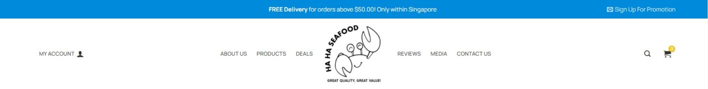
Ha Ha Crabs – Center Header with menu side by side, no padding, certain items remain same position
** To note that this is not the best practice as it is recommend to put the logo at the left side of the header. This is proven that visitor can recognize the logo more easily than the other position.
Published by: Moses
If there is any other better way please let me know