Stock photos can be said to be the lifeline of marketing. After all, we depend on them to create stunning and engaging visuals no matter if it is for a display banner or an outdoor billboard.
The problem? Stock photos often have a certain “stock-like” look to them. Whether it’s an incredibly cheesy pose or over-the-top reactions, stock-based visuals, if not done right, can be an eye-sore to your increasingly ad-savvy customers!
So, if you’ve been thinking of how to make your marketing assets look less like it’s been plucked straight out of a database, here is Heroes Of Digital’s ultimate guide to making your stock photos less stock-y.
1. Avoid an overused or recognizable model if possible


2. Crop out the model’s face to bring focus on the subject instead
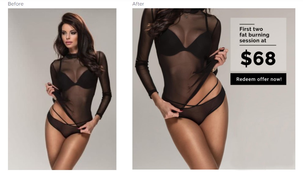

3. Split an otherwise ordinary photo into half – customize it by aligning it left & right with high contrast editing


4. Play with asymmetry by cropping ordinary full faces into half, as well as shifting to the left or right for word placement
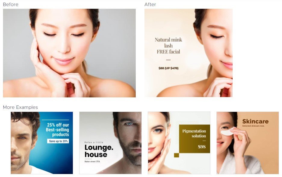
5. Greyscale can work wonders to highlight your product or the subject
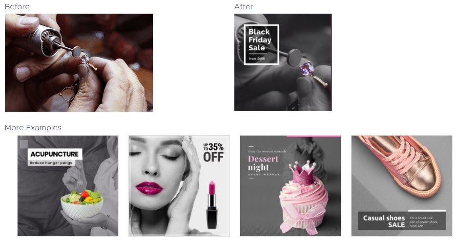
6. Refrain from displaying the whole image’s background by adding object or combining images
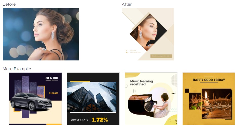
7. Capture and utilize genuine emotional cues
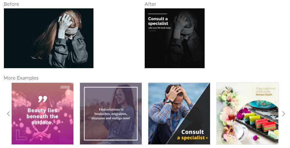
8. Image manipulation – rotate, zoom, flip or mirror & other techniques. Stock photos are often shot in generic positions to appeal to a wide market. Aim to make your visual look as if it came from a personal studio.
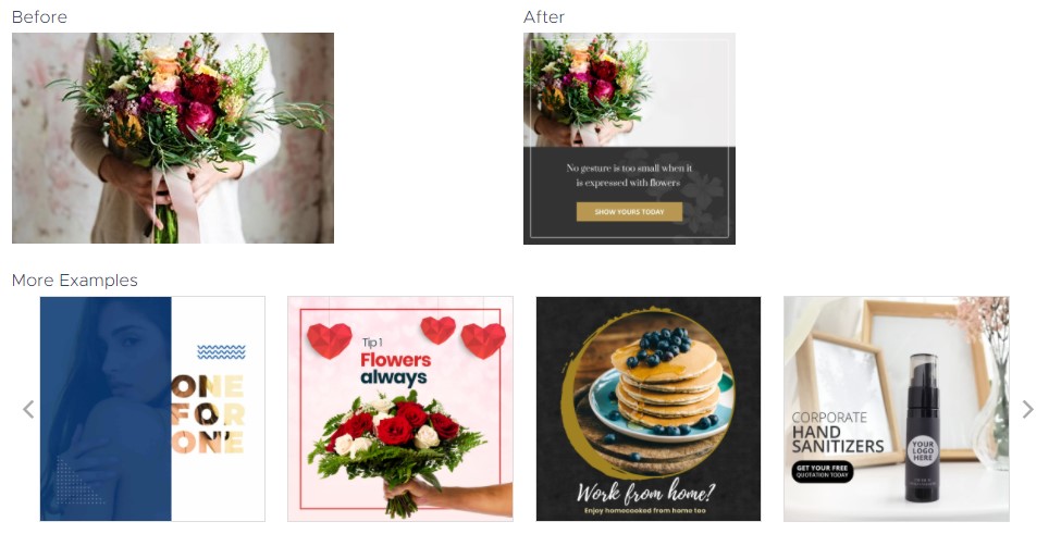
9. Apply a gradient fade on an image horizontally or vertically

10. Authenticity – find candid photos to show genuine moments over photos that are over-posed

11. Split an otherwise ordinary front-shot to make a stunning comparison
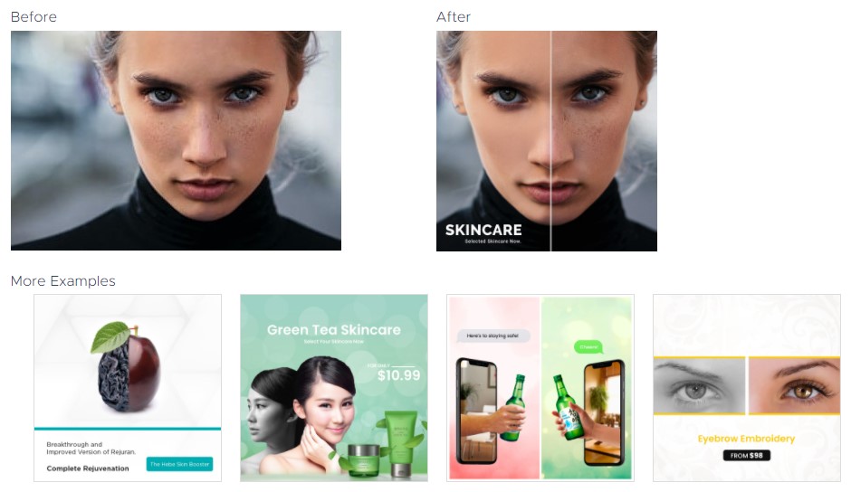
12. Most stock photos will be shot in the safest-possible colour scheme (which looks generic), so changing the colour drastically can make it unique to your brand

13. Don’t be afraid to mix images and vectors (symbols, emojis, FB/IG texts) as long as it fits the brief and brand.

14. 99% of stock photos are shot with wide depth of field (everything is focused). Making a focus-point separates the generic from the stunning.
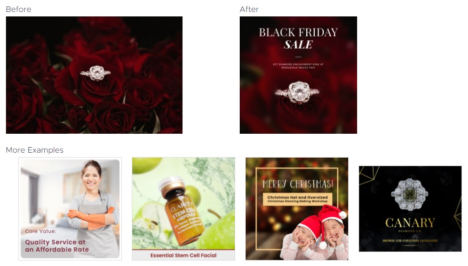
15. Perspective – choose photos that are not shot from typical & cheesy angles
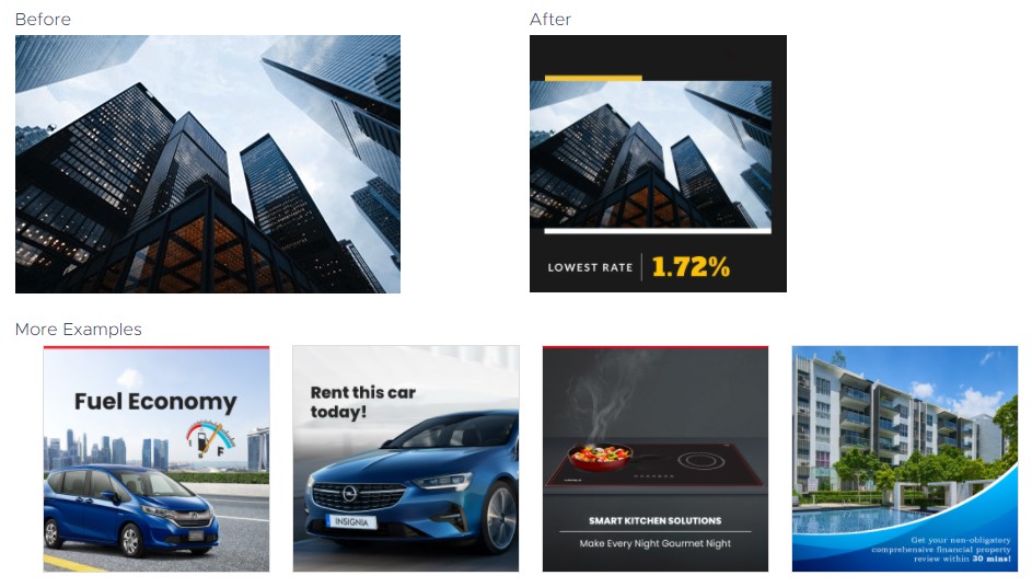
16. Typography Design – make full use of text as a main design element
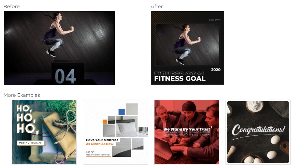
17. Blending Options – this is a quick technique to to boost your visual creativity

18. Mix it up – combine your actual product with a stock vector or 3D illustration

19. Eye candy – play with exciting and striking colour palettes to embolden a design or brand
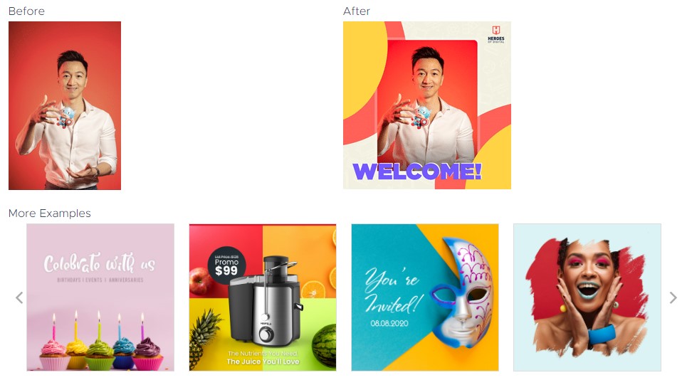
20. Combine Real & Flat – Combining The 2D and 3D can give your visual liveliness

21. Manipulate the saturation and hue, adjusting the level to be consistent with your branding

22. Combine several illustrations and blend them into one setting for a great and compact graphic

23. Combine interesting elements with themes that connect to each other (e.g. women & flowers, wood & fire)
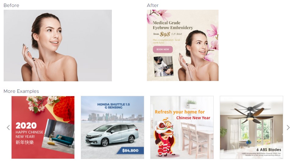
24. Keep an eye out for visuals that can be cropped effectively

25. Keep it simple – flip images for text settings
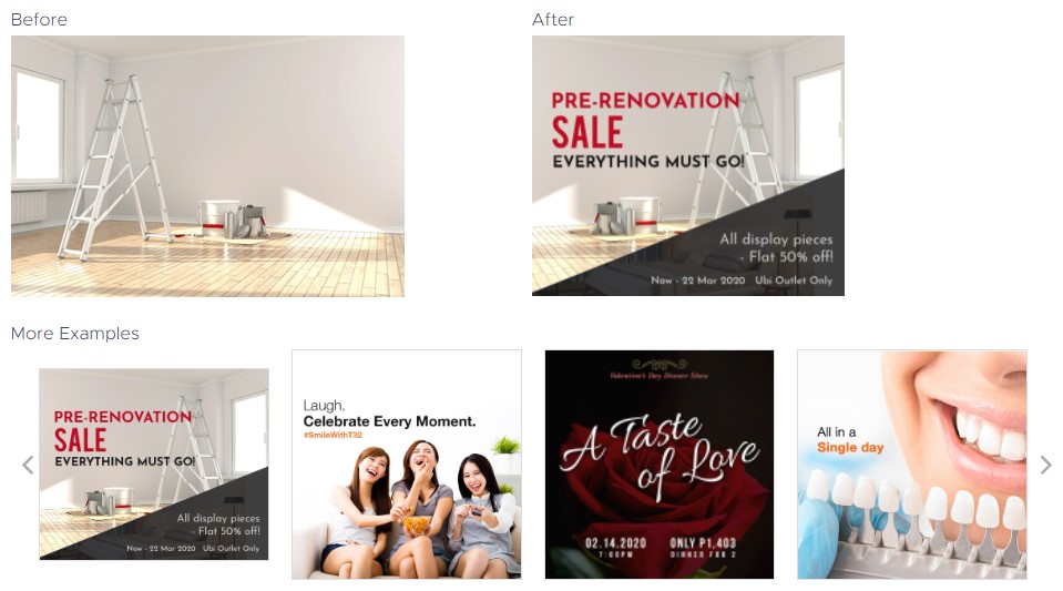
26. Utilize humor & inject some fun in to your visuals – remember, customers are people who respond to humor!

27. If your products are vastly different, combine them under a single colour
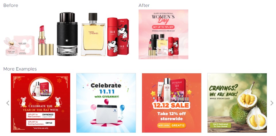
28. Make a strong and irresistible proposition

29. Behind every good design is good application of contrast
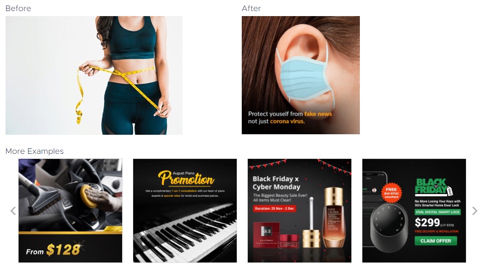
30. Make full use of photoshop to single-out your product’s main color
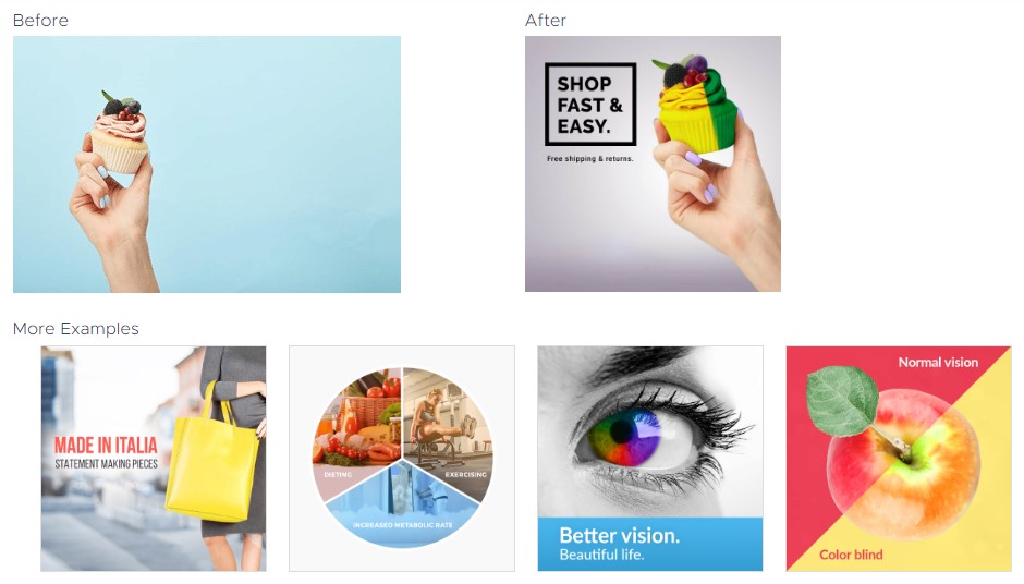
31. With some photography and styling, you can add other top view elements to support the main product
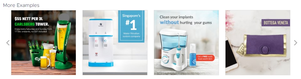
32. 2-in-1 Design & Info – combine bold texts into the visual to make a bold statement